While helping one of my students, Oleg Karapaev, in his struggle with a paper on determinants of divergence between “fair” and observed prices in stocks (written as a part of his bachelor research project), I’ve made some observations perhaps worth sharing with blogosphere. I used some R code and ggplot2 + ggthemes by Jeffrey Arnolds to represent findings visually (important: to replicate code in full you should have an access to Bloomberg and Rbbg package to download data).
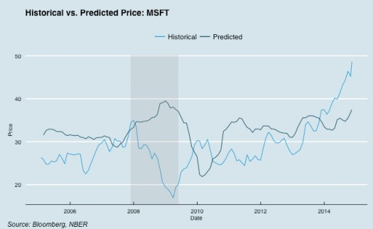
Bloomberg collects target prices for equities from sell-side research analysts. They claim to have around 1500 contributors around the world. Generally speaking, sell-side analysts are not directly interested in quality of their research, at least not as interested as buy-sides are (see how Investopedia explains it.) Usually, when you plot blended forward 12-month target price (consensual between several analysts, covering stock), you expect to see something like the plot in the beginning of the post (shaded zone is last crisis, below – the code to generate it).
library(ggthemes)
library(xts)

## Here and below, prices and targets are matrices with historical ## and target prices, downloaded from Bloomberg with rBbg package. ## Tickers are in columns, dates in rows. See full code below

ticker <- 'MSFT'
range <- '2005-01-01::'
crisis <- data.frame(start = '2007-11-30', end = '2009-05-29')
dtf <- xts(
 data.frame(
 historical = as.numeric(prices[12:nrow(targets),ticker]),
 predicted = as.numeric(targets[1:(nrow(prices)-11),ticker])),
 order.by = time(prices[12:nrow(targets),ticker]))[range]
dtf <- data.frame(dtf)
dtf$Date <- as.Date(rownames(dtf))

ggplot(data = dtf) +
 geom_line(aes(x = Date, y = historical, col='Historical')) +
 geom_line(aes(x = Date, y = predicted, col='Predicted')) +
 theme_economist() +
 scale_colour_economist() +
 theme(legend.title=element_blank()) +
 geom_rect(data=crisis, aes(xmin=as.Date(start), xmax=as.Date(end),   ymin=-Inf, ymax=+Inf), fill='blue', alpha=0.2) +
 xlab("Date") + ylab("Price") +
 ggtitle("Historical vs. Predicted Price: MSFT")
grid.text("Source: Bloomberg, author's calculations",
 x = unit(.02, "npc"),
 y = unit(.01, "npc"),
 just = c("left", "bottom"),
 gp = gpar(fontface = "italic", fontsize = 12, col = "black"))
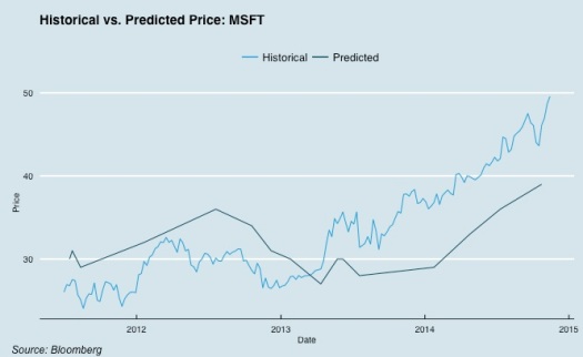
Just like notorious broken clocks, that are correct twice a day, analysts hit real price twice a year or so (you can never guess when exactly that would happen), and the thinner the crowd watching the stock – the worse is result. Random analyst picked individually would produce even more humiliating picture:
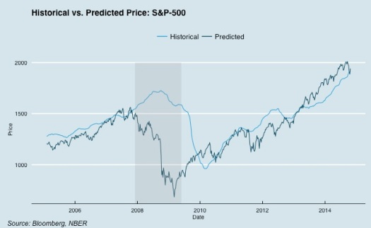
Actually it’s a well known fact in finance, that sell-sides are wrong, irrational, not adding value, etc, etc. Imagine my surprise when I plotted projected consensual S&P price over historical S&P:
So, analysts are terribly wrong individually, when they are predicting single stock price; just a notch better, when they do it as a group; and absolute killers, when they do it as group for a group of stocks. There is only one moment, when they are still terribly wrong, and it’s crisis. And that’s understandable: as you can see, their forecasts aggregately are nothing more than linear extrapolation, and of course it works OK when market is in sustainable trend, upward or downward.
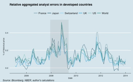
Unfortunately, I can not plot projected targets for every equity index, as it seems that Bloomberg is storing index-aggregated target price only for US majors. So I downloaded aggregated target prices for stocks-components of S&P500, FTSE, SMI, CAC-40, Nikkei and STOXX-1800 (at the end of the post you’ll find the code to download it yourself, if you have access to Bloomberg Terminal). Then I calculated relative errors for every index in the following manner:
calc.meanerrors <- function(prices, targets) {
  require(xts)
  # select tickers with at least 10 estimates each
  bestPX.tickers <- colnames(targets)[apply(targets, 2,
                        function(col) {length(na.trim(col)) > 10})]
  targets <- subset(targets, select=bestPX.tickers)
  prices <- subset(prices, select=bestPX.tickers)

  errors <- (targets[1:(nrow(prices)-11),] -
               prices[12:nrow(targets),])/prices[12:nrow(targets),]
  errors[is.na(errors)] <- NA

  mean.errors <- apply(errors, 1, mean, na.rm=T)
  mean.errors <- xts(mean.errors, order.by=time(errors))
  return(mean.errors)
}
It’s not pure index-aggregated errors, as Bloomberg allowed me to take only current index components (and its composition has changed significantly over last 10 years, not mentioning issues with dead series).
Now let’s plot it:
ggplot(data = errors.dev) +
 geom_line(aes(x = Date, y = UK, col='UK')) +
 geom_line(aes(x = Date, y = Switzerland, col='Switzerland')) +
 geom_line(aes(x = Date, y = Japan, col='Japan')) +
 geom_line(aes(x = Date, y = France, col='France')) +
 geom_line(aes(x = Date, y = US, col='US')) +
 geom_line(aes(x = Date, y = World, col='World')) +
 theme_economist() +
 scale_colour_economist() +
 theme(legend.title=element_blank()) +
 geom_rect(data=crisis, aes(xmin=as.Date(start), xmax=as.Date(end),
 ymin=-Inf, ymax=+Inf), fill='blue', alpha=0.2) +
 xlab("Date") + ylab("% of historical price") +
 ggtitle("Relative aggregated analyst errors in developed countries")
grid.text("Source: Bloomberg, author's calculations",
 x = unit(.02, "npc"),
 y = unit(.01, "npc"),
 just = c("left", "bottom"),
 gp = gpar(fontface = "italic", fontsize = 12, col = "black"))
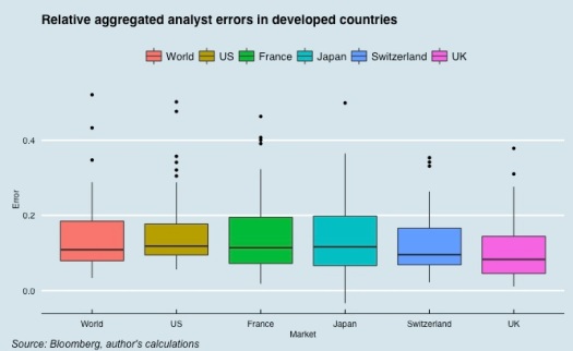
Exactly at the end of the crisis (I took official NBER boundaries) error approaches zero line, i.e. year ago (mid-2008) analysts estimated future stock prices without biases. Let’s make boxplot and compare averages:
errors.melt <- NULL # have to convert data to suitable format
for (colN in 1:(ncol(errors.dev)-1)) {
 temp <- as.numeric(na.omit(errors.dev[,colN]))
 dates <- time(na.omit(errors.dev[,colN]))
 temp <- data.frame(dates, temp, rep(colnames(errors.dev)[colN], length(temp)))
 errors.melt <- rbind(errors.melt, temp)
}
colnames(errors.melt) <- c('Date','Error', 'Market')
ggplot(errors.melt, aes(x = Market, y = Error, fill=Market)) +
 geom_boxplot() +
 theme_economist() +
 scale_colour_economist() +
 theme(legend.title=element_blank()) +
 ggtitle("Relative aggregated analyst errors in developed countries")
grid.text("Source: Bloomberg, author's calculations",
 x = unit(.02, "npc"),
 y = unit(.01, "npc"),
 just = c("left", "bottom"),
 gp = gpar(fontface = "italic", fontsize = 12, col = "black"))
Variation across markets is not high. Error is almost always positive, i.e. on average real price would be 10% lower than analyst estimates.
Errors are highly correlated across countries (mean correlation of errors is 0.91). In addition to 2007-2009 splash in errors we have clear but smaller peaks in 2010, 2011 and 2012. Clearly, all that splashes are correlating with markets drawdowns, which support the idea that sell-side brokers aggregately are just predicting the past, and constantly fail to predict market turning points.
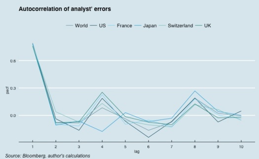
Another interesting point is that it seems there is a short-term memory in errors, which could be seen by inspecting partial autocorrelations plots:
errors.pacfs <- NULL # calculate PACF functions
for (colN in 1:(ncol(errors.dev)-1)) {
 temp <- pacf(errors.dev[, colN], lag.max = 10)
 errors.pacfs <- cbind(errors.pacfs, temp$acf)
}
colnames(errors.pacfs) <- colnames(errors.dev)[1:(ncol(errors.dev)-1)]
errors.pacfs <- data.frame(errors.pacfs)
errors.pacfs$Lag <- rownames(errors.pacfs)
errors.pacfs.melt <- NULL # reshape dataframe in suitable format
for (colN in 1:(ncol(errors.pacfs)-1)) {
 pacfs <- errors.pacfs[,colN]
 country <- colnames(errors.pacfs)[colN]
 lags <- rownames(errors.pacfs)
 temp <- data.frame(pacfs, country, lags)
 errors.pacfs.melt <- rbind(errors.pacfs.melt, temp)
}
colnames(errors.pacfs.melt) <- c('pacf','market', 'lag')
errors.pacfs.melt$lag <- as.numeric(errors.pacfs.melt$lag)
ggplot(data = errors.pacfs.melt,
 aes(x = lag, y = pacf, group=market, colour=market)) +
 geom_line() +
 theme_economist() +
 scale_colour_economist() +
 theme(legend.title=element_blank()) +
 scale_x_discrete() +
 ggtitle("Autocorrelation of analyst' errors")

grid.text("Source: Bloomberg, author's calculations",
 x = unit(.02, "npc"),
 y = unit(.01, "npc"),
 just = c("left", "bottom"),
 gp = gpar(fontface = "italic", fontsize = 12, col = "black"))
Still, aggregated brokers estimates seem to be surprisingly good in predicting returns of indices during ‘calm’ periods. Perhaps that makes them very attractive for single-index models, which would be the next thing I backtest and blog.
Code to download data from Bloomberg:
library(Rbbg)
library(xts)

key <- blpConnect()
tickers <- bds(key, 'SPX Index', 'INDX_MEMBERS')[,1]
tickers <- paste(tickers, 'Equity')
fields <- c('PX_LAST', 'BEST_TARGET_PRICE')
start_date='19950101'
dates <- bdh(key, 'SPX Index', fields, start_date)[,1]
targets <- matrix(NA, ncol=length(tickers), nrow=length(dates))
rownames(targets) <- dates
colnames(targets) <- substr(tickers, 1, 4)
targets <- as.xts(targets)
prices <- targets
for (Nticker in 1:length(tickers)) {
 temp <- bdh(key, securities=tickers[Nticker], fields, start_date)
 temp <- as.xts(temp[,2:(length(fields)+1)])
if (nrow(temp) > 1) {
 temp1 <- temp[time(prices),]
 prices[time(temp1),substr(tickers[Nticker], 1, 4)] <- temp1[,'PX_LAST']
 targets[time(temp1),substr(tickers[Nticker], 1, 4)] <- temp1[,'BEST_TARGET_PRICE']
 print(paste(tickers[Nticker], ', ', nrow(temp1), 'точек'), sep='') } else print(paste('Для тикера', tickers[Nticker], 'нет данных'))}
# besteps <- apply.monthly(besteps, mean, na.rm=T)
# histeps <- apply.monthly(histeps, mean, na.rm=T)
# histcfs <- apply.monthly(histcfs, mean, na.rm=T)
# bestcfs <- apply.monthly(bestcfs, mean, na.rm=T)
# targets <- apply.monthly(targets, mean, na.rm=T)
# prices <- apply.monthly(prices, mean, na.rm=T)
# save(prices, targets, file='spx.BEST.monthly.Rdata')

I get errors
What am I doing wrong?
> ticker range crisis dtf dtf dtf$Date <- as.Date(rownames(dtf))
Error in rownames(dtf) : object 'dtf' not found
LikeLike
you don’t have ‘dtf’ dataframe, which is built by taking one column for historical, and one – for predicted price for ticker (‘MSFT’) in your example (see comments in the beginning of the code).
Basically, you can replicate this code only if you have access to Bloomberg, otherwise you have to find other sources for data and modify code slightly.
LikeLike
Very interesting and thanks for the code. I replicated the code and worked fine. will further analyze it and keep you posted. Thanks again
LikeLike
How to know in advance when stock market analysts are wrong? –